| 7.5. The synthesis maps | ||
|---|---|---|
 | Chapter 7. MTA parameters |  |
| 7.5. The synthesis maps | ||
|---|---|---|
| | Chapter 7. MTA parameters | |
One synthesis map was already available in the previous version of Standard HyperAtlas, based on three levels and one treshold, it is described in Ternary synthesis map. A new synthesis map has been added to the application since the version 2.0: see Dual synthesis map.
The three relative positions about contexts are summarized in one synthetic map. The elementary units are classified in eight classes according to their three relative positions.
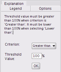
In order to reduce the whole combinatory of possible cases, from the "Options" tab close to the synthesis map (Figure 7.7), the user must specify which point of view he wants to focus on: the first "Criterion" parameter shows whether the point of view is to underline the regions whose ratio is greater than, or to underline the contextual values, by selecting less than. This choice depends on the studied indicator (see An example of multiscalar typologies of regions section). For instance high values of unemployment rates point out different types of regions than high values of an indicator of resources. According to which regions have to be differentiated (lagging ones or wining ones), the user must chosse the point of view of the synthesis. Then, the user can choose the threshold percentage.
The map on Figure 7.8 illustrates the eight different configurations of relative position, according to the three previously chosen contexts and parameters. The legend tab gives for each class the descriptions of the contextual positions. The last class (in white) gather the regions that are not concerned by the chosen comparative criterion whatever the contexts are.
Figure 7.8. Synthesis map tab
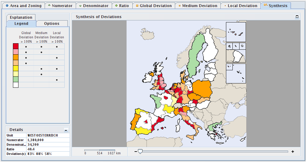
This screenshot shows the synthesis map tab for the contexts that were chosen in the previous example shown on Figure 7.6.
When “Histogram” is enabled (see Section 6.3 section), the user may represent the three contextual deviations of a selected (clicked) region as an histogram as shown on Figure 7.9.
Figure 7.9. A deviations synthesis histogram for a regiion
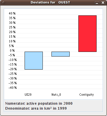
This screenshot shows the synthesis histogram of the clicked region named OUEST (West of France). The general deviation
of this region is relative to the UE29 general context. The territorial deviation is relative to the NUTS 0 hierarchical
context, the spatial deviation considers the contiguity, e.g. the neighborhood of this region.
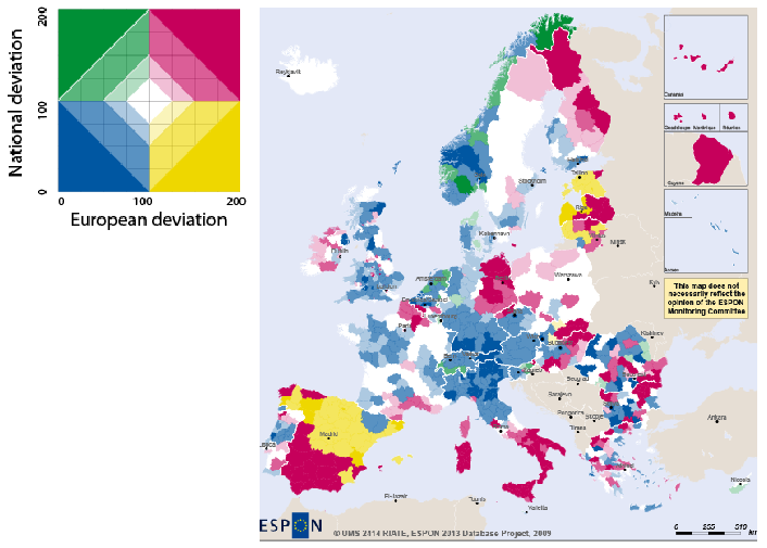
The dual synthesis map is a new cartographic tool that has been introduced in the version 2.0 of Standard HyperAtlas. It aims at showing via a chromatic legend the status of territorial units on taking into account two chosen deviations. This section describes the synthetis opportunity that is offered to analysts thanks to this tool.
The legend of the dual synthesis map shown on Figure 7.10 is composed of four main quarters. The values on both axis range range from 0 to 200% and they represent the percentages of a deviation of a territorial unit relatively to a context of reference. The user is invited to select in an options tab the contexts of deviations to be considered for both axis (among the general, the territorial or the spatial context).
Let's consider the following example: the general deviation has been chosen for the horizontal axis and the spatial deviation for the vertical axis. The four main colors of the legend represent the following cases:
yellow: the global deviation (X axis) is lower than 100% (the average pivot value) and the spatial deviation (Y axis) is upper 100%
red: both deviations are upper 100%
blue: both deviations are lower than 100%
green: the global deviation (X axis) is upper than 100% and the spatial deviation is lower than 100%
Figure 7.10. Legend of the dual synthesis map
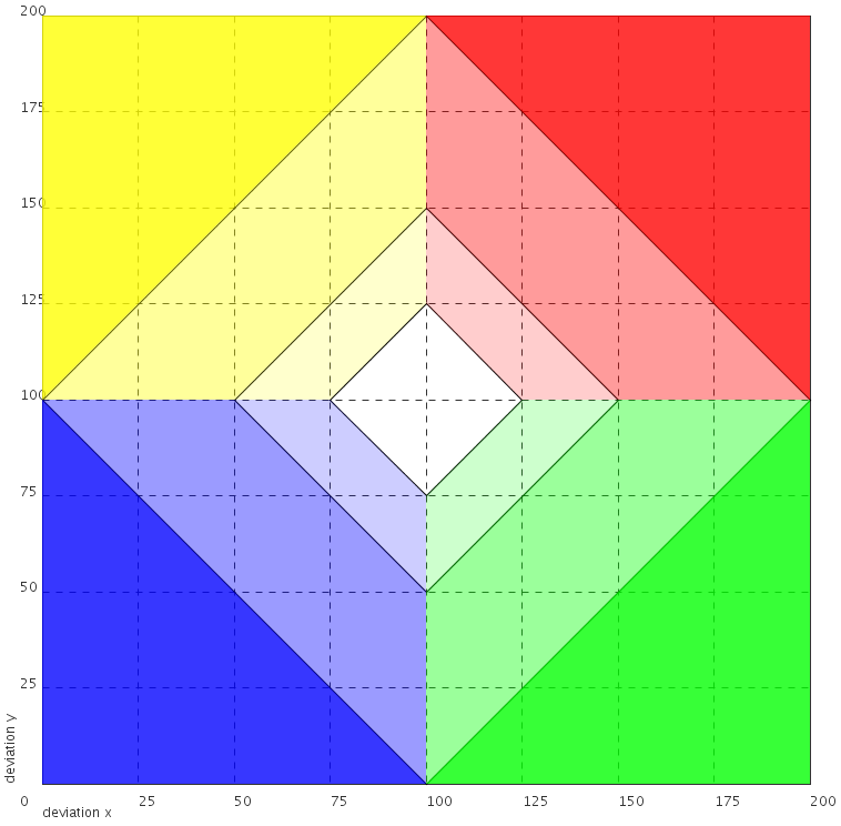
Graduations and quarters of the dual deviation synthesis map legend.
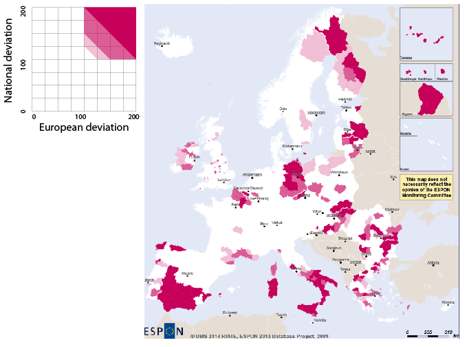
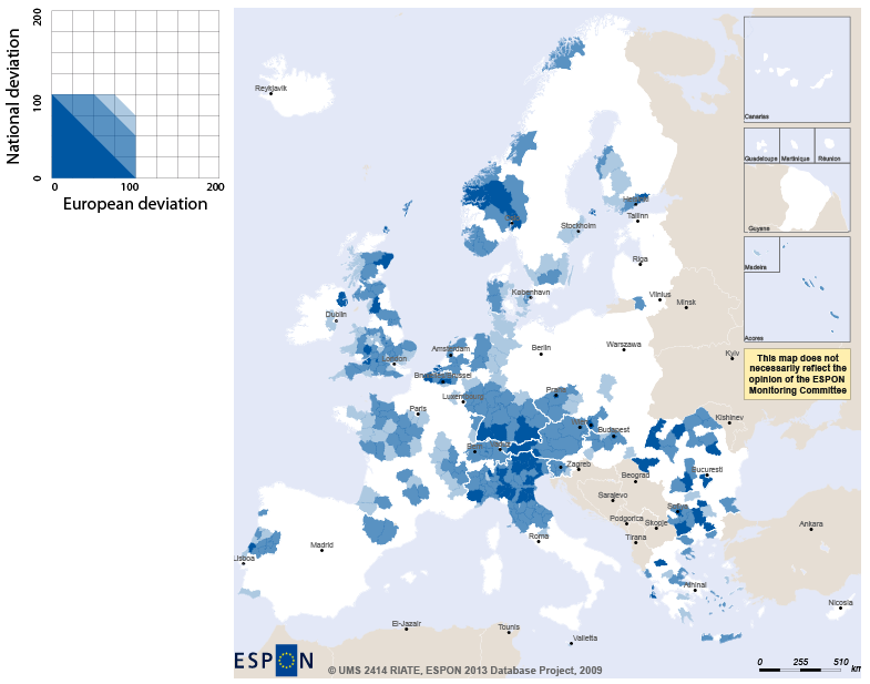
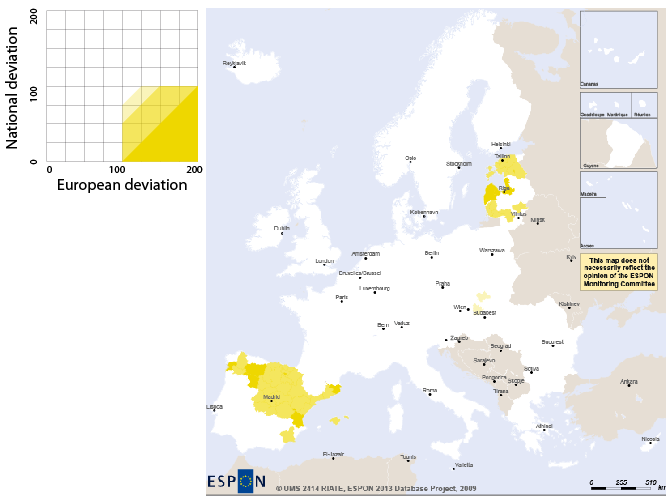
Let's consider now a concrete example on how the dual deviation map can help analysts: the following screenshots decompose as four steps the synthesis about the situation in 2010 according to the European and National averages of unemployement:
Figure 7.11 shows in red the territorial units whose unemployement rate is above average both at European and National levels:
Figure 7.12 shows in blue the territorial units whose unemployement rate is under average both at European and National levels:
Figure 7.13 shows in yellow the territorial units whose unemployement rate is above average at European level and under at National level:
Figure 7.14 shows the final typology on the complete synthesis map:
| |  | |
| 7.4. Setting the contexts for deviations |  | Chapter 8. Tools |